
Brand guidelines · v1.2
The FILMD brand.
How FILMD looks, sounds and moves. This is a living document: it describes the site as it's built today and changes as the brand does. Last updated 11 October 2026.
Principles
A light product on a cinematic stage.
FILMD should feel like premium software the whole industry relies on, made by people who love film. Every decision comes back to these six ideas.
Cinematic, not dark for its own sake
The near-black ground is a screening room: it makes the product and the people glow.
Show the real thing
Real screenshots and real members, never imitations. If we can't show it, we don't fake it.
Proof over promises
Live numbers, named partners and roles from real productions do the persuading.
One clear action
Every page leads to the same place: create a free account.
Restraint with one moment
Quiet, precise layouts, with one theatrical moment per page: a stage, a story or a number.
Honest about what's next
Beta and coming-soon features are always labelled, so trust is never spent.
Logo
The one thing that never changes.
Use the supplied files only, in their official colours. Keep clear space of at least the height of the “F” on every side, and never use it smaller than 72px wide on screen. Don't add effects, outlines or shadows, don't recolour or stretch it, and don't place it over busy images.





Colour
Near-black, white and one purple.
The ground is a violet-tinted near-black, never pure black. Text is white and two greys. Purple is the only accent: on buttons, and in its lighter lilac form for links, labels and icons. No gradient text, no second accent.
Ground
- Ground
#0B0A14 · --fh-bgPage background - Surface
#110F1E · --fh-bg-softAlternate sections, cards - Raised
#16132AFeatured card, stat bands - Line
#221F33 · --fh-lineHairlines, card borders - Line strong
#2F2B45 · --fh-line-strongOutlines, inactive titles
Text
- Ink
#FFFFFF · --fh-inkHeadings, key text - Body
#B9B7C9 · --fh-bodyParagraphs - Muted
#A09EB2 · --fh-mutedCaptions, meta (7.5:1)
Accent
- FILMD Purple
#6450EC · --fh-accentPrimary buttons (white text, 5.4:1) - Purple hover
#7563FF · --fh-accent-hoverButton hover - Lilac
#AB9DFF · --fh-accent-textLinks, eyebrows, icons, tags on dark - App purple
#7B67FFInside product screens only
Light sections
White where people get work done.
The site is dark, but the product is light. When a section is somewhere people do something, such as filling in a form, it switches to white, like stepping into the app. Use it sparingly: one light section per page at most, and never for marketing copy alone.
- Light ground
#FFFFFF · --fh-bgLight section background, form cards - Field
#F6F6F9 · --fh-bg-softInput fills - Light ink
#0E0D16 · --fh-inkHeadings and labels - Light body
#4A4957 · --fh-bodyParagraphs - Light muted
#555461 · --fh-mutedCaptions, meta on white (7.4:1) - Light line
#D4D4DF · --fh-line-strongInput borders - Purple on white
#5441D9 · --fh-accent-textLinks and labels on white
Form field
White card on the white section, soft shadow, grey-filled inputs with a clear border, dark labels. Used on Post a job and Jobs partnership.
Typography
Host Grotesk, set tight.
One family for everything on the site: Host Grotesk (free, open licence), self-hosted. Display sizes are set in 600 with tight tracking; text is 400 and 500. Inside product screenshots the app's own Poppins stays as it is.
Find your next crew.
From the first draft to the premiere.
Find your cast and crew.
The professional network and production platform for UK film and TV.
Post roles on the jobs board, search the members map by role and distance, and invite people straight onto the production.
Script to screen
Captions, notes and meta. Host Grotesk's lowercase is about 10% shorter than Poppins at the same size, so small text is set a size up.
Components
The pieces every page is built from.
All pages use the same kit, so the site stays uniform. These are the live components.
Buttons
Pill shape, 48px tall. Purple for the main action, outline for everything else. One main action per view.
Tags
Outlined, uppercase, small. Used for status only, never decoration.
Product window
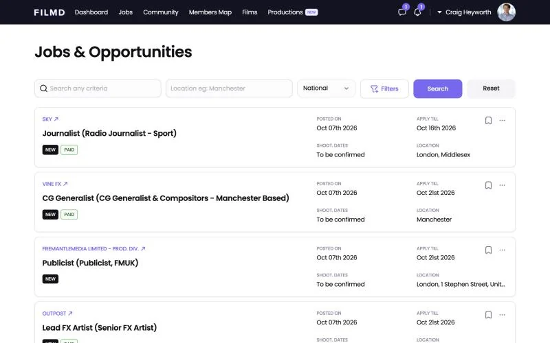
Every screenshot sits in this window: light chrome, real URL, 14px radius, deep soft shadow. The product stays light.
Quote
“This is the best online filmmaker's experience I've ever had.”
 William SimmonsDirector
470+
productions have been created on FILMD.
Stat moment: one real number at display scale over code-drawn rings. At most two per page.
Imagery
Real or nothing.
Our product and our members are the imagery. Screenshots are the real app; people are real members shown as themselves. When we don't have the real thing, we use type instead.
Do
- Real FILMD screenshots, shown in a browser window.
- Real members and grant winners who have agreed to appear, with their real roles.
- Product screens stay light inside the dark page, like lit screens in a dark room.
- Real film work from members (posters, stills) with permission.
Don't
- AI-generated people, sets or film stills.
- Hand-drawn imitations of the product.
- Stock photography of film sets.
- Other members' names or messages without consent.
Patterns we never use
Nothing that looks generated.
These are the stock patterns that make a site read as templated or AI-made. If a design reaches for one, find a display that fits the content instead.
Do
- Status shown with words and tags: Live, Beta, Coming soon.
- Lists of roles set as type or as a department index.
- Displays chosen for the content: a tour, a timeline, a spec sheet, an annotated screen.
Don't
- Coloured status dots, glowing or pulsing (the green, purple and orange traffic light). Show status with type, tags or the material of the card.
- Outlined pill chips for lists of names, roles or categories. Use type, an index or a table instead.
- Icon tiles: an icon in a tinted rounded square above every card.
- Gradient or highlighted words inside headlines, and glassy blurred cards.
- Rows of identical icon cards back to back. Vary the display with the content.
- Announcement pills above a headline: a rounded outline with a divider, a short line and an arrow. Set recognition like a press credit instead.
Motion
Calm, precise, purposeful.
Motion should feel like a camera move, not a firework: slow lights, confident entrances, and one orchestrated moment per page.
| Use | Spec | Where |
|---|---|---|
| Entrance | 1000ms · cubic-bezier(0.16, 1, 0.3, 1) · rise 28px | Hero copy and product stage on load, staggered 100–260ms |
| Reveal | 900ms · expo out · 40px | Sections as they scroll into view (only below the fold) |
| State | 300ms / 600ms · cubic-bezier(0.65, 0, 0.35, 1) | Hovers, menu, tab and screen changes |
| Spotlights | 9–13s loops · alternate · travel up to a quarter of the screen | Behind every hero; never behind buttons |
| Glow drift | 10–14s loops · alternate · drift ≤9% and scale ≤15% | Glows behind product windows, the scroll story and closing sections |
| Stage tilt | Scroll-linked · 14° → 0° over half a screen | Homepage product stage settles flat as you scroll |
| Reduced motion | No movement · finished states shown | Every animation has a still version |
Voice
A fellow filmmaker who knows the business.
Plain, honest and warm. We write from the reader's side of the screen and say exactly what things do.
Do
- Plain UK English, short sentences, sentence-case headings.
- Real, checkable facts: the live member and production counts, named partners.
- Say what something does: “Post roles on the jobs board.”
- Label anything unreleased “Coming soon” or “Beta”, every time.
- One main action everywhere: “Create free account”.
Don't
- Hype words: revolutionary, seamless, unlock, elevate, game-changing.
- Slogans built as “Not X. Y.” or “No X. No Y. Just Z.”
- Highlighted or gradient words inside headlines.
- Invented numbers, quotes, customers or partners.
- Dashes as punctuation: use commas, colons or full stops.
Changelog
How the brand has changed.
- v1.210 October 2026
Added patterns we never use: coloured status dots, outlined pill chips, icon tiles, gradient words, repeated icon cards and announcement pills.
- v1.110 October 2026
Light sections added: white sections for places where people work, such as forms, starting with Post a job and Jobs partnership.
- v1.010 October 2026
Dark direction adopted across the site: near-black violet ground, white type, Host Grotesk, real screenshots, drifting spotlights.
Questions about using the brand? Email mediafilmd.co.uk.